Beginner TAP Tutorial - Single Table Usage in the Portal Aspect
This brief tutorial will show you how to perform the same data retrieval and analysis that is shown in the first of the Jupyter notebook tutorials (titled “Intro to DP0”) by using the Portal Aspect’s Single Table TAP search function.
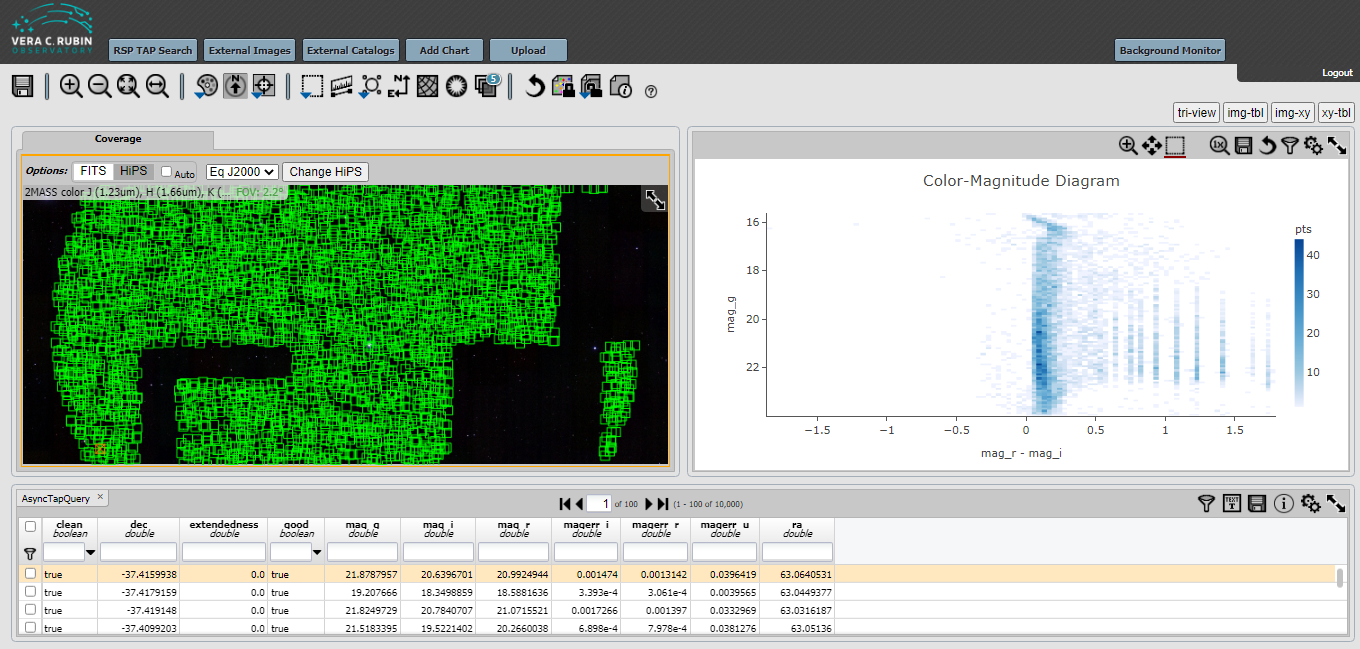
In this tutorial we will extract data from a small region of sky in the object table and build a Color-Magnitude Diagram.
This tutorial assumes you have read the basic introduction to the Portal Aspect in Introduction to the RSP Portal Aspect.
Select portal aspect from RSP
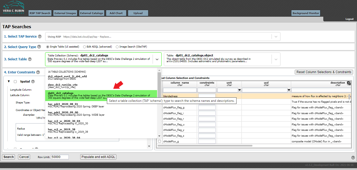
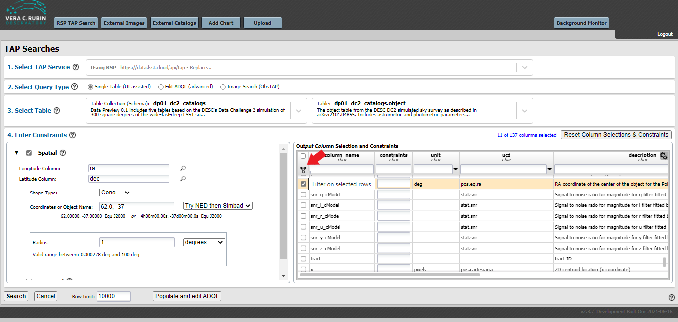
After logging into the Portal Aspect, select Single Table (UI assisted) from the Select Query Type, then select the dp01_dc2_catalogs (left) and dp01_dc2_catalogs.object (right) from the Select Table drop down menus.
This is demonstrated in the next figure.
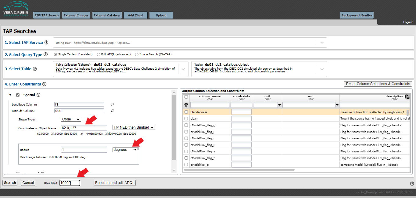
Next, select the “Spatial” checkbox under Enter Constraints, the “Longitude Column” and “Latitude Column” should automatically populate with ra and dec.
Enter the coordinates of 62.0, -37.0 in the “Coordinates or Object Name:” area.
Choose a radius of 1 degree and select a row limit of 10,000, as shown in the next figure.
Select columns for analysis
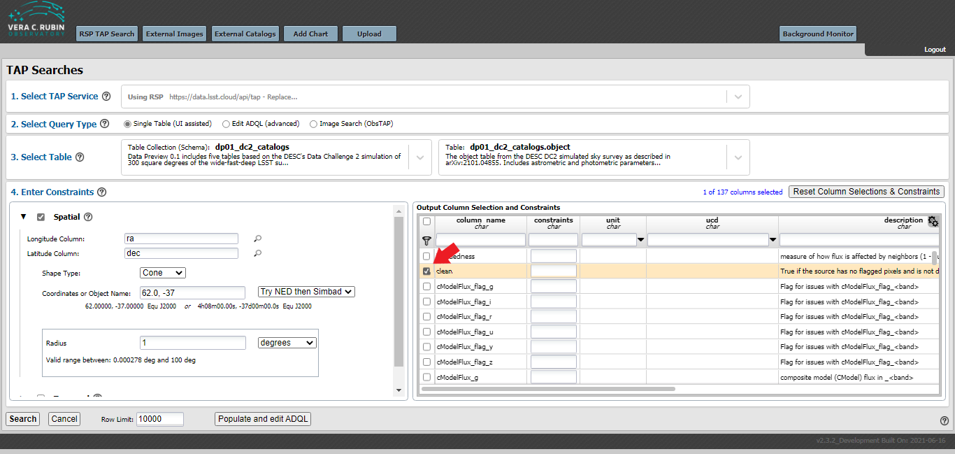
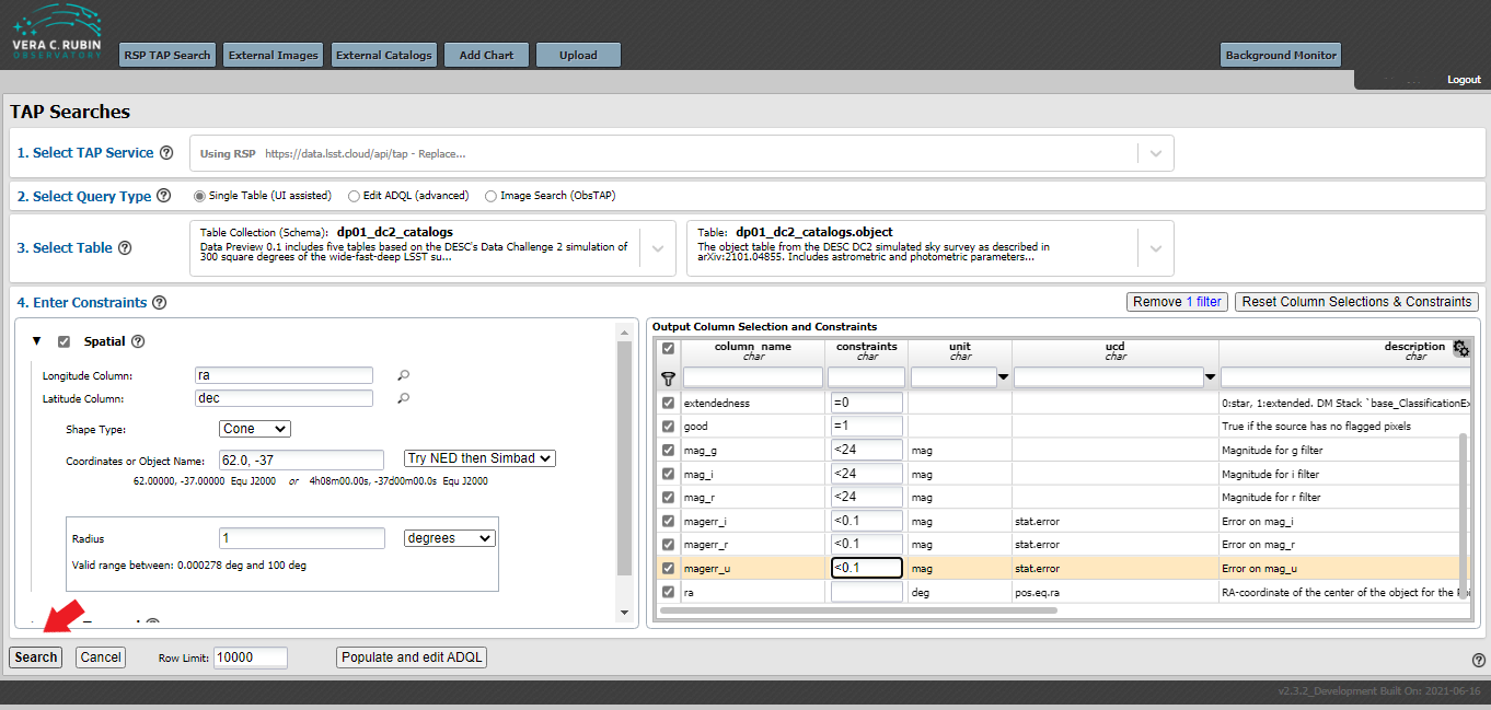
In the “Output Column Selection and Constraints” window on the lower right-hand side of the under Enter Constraints, select the following items:
clean, dec, extendedness, good, mag_g, mag_i, mag_r, magerr_g, magerr_i, magerr_r, and ra.
A portion of this step is demonstrated in the next figure.
Use the search box under “column_name” to quickly find columns of interest: for example, type “mag” into that box and press enter to see only column names that contain “mag”.
Then, press the filter icon to select only those items for analysis, as shown in the next figure.
Select columns constraints
After you press the filter icon, you should have only those items you selected shown in the “Output Column Selection and Constraints” table.
You may now add your column constaints to the table.
For this example, use the following values:
clean = 1, dec leave blank, xtendedness = 0, good = 1, mag_g <24, mag_i <24, mag_r <24, magerr_g < 0.1, magerr_i < 0.1, magerr_r < 0.1, ra (leave blank).
Then, press the “Search” button as shown in the next figure.
Select configure the graph to create a color magnitude diagram
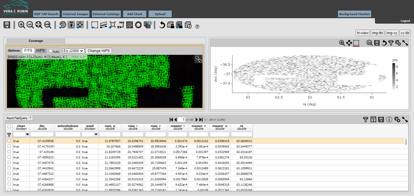
The next figure shows the results of the search. The gaps in the spatial coverage of the returned catalog objects is due to the limit of 10,000. The gaps for your search might be different from what is shown below.
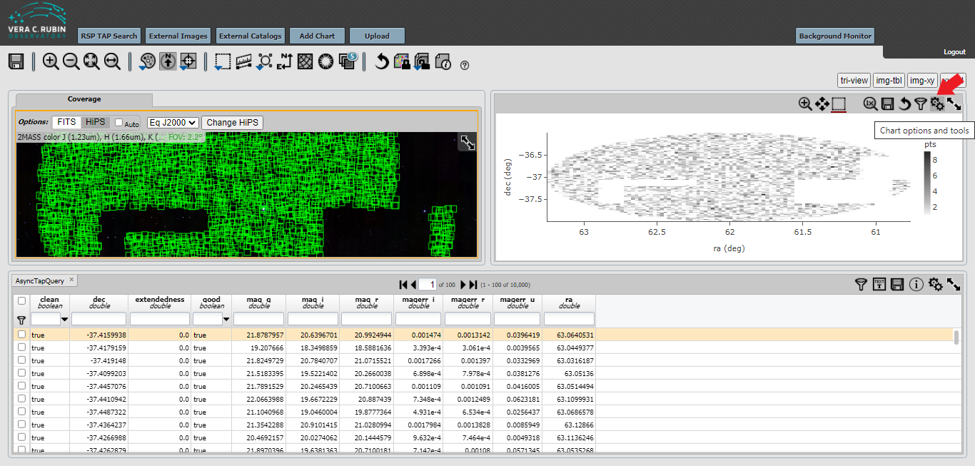
Next, click on the double gear icon on the upper right-hand window, as shown in the next figure.
Finally, change the parameters in the selection box.
Set X to be mag_r - mag_i and set Y to be mag_g.
Under Chart Options, select “reverse” under the “Y Label”.
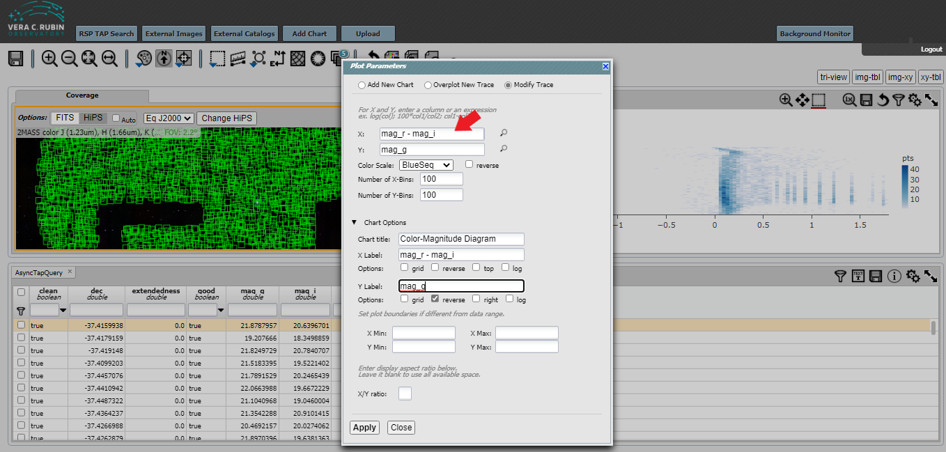
After including any other information such as a “Chart title,” “X Label,” and “Y Label”, hit “Apply.” The plot that you make will be slightly different from what is shown below, and different from the plot in the first of the Jupyter notebook tutorials due to random sampling and the 10,000 maximum that we used.