Advanced TAP/ADQL Usage in the Portal Aspect
Now that you have seen the basic functionality of the Portal Aspect and some demonstrations of ADQL queries from Introduction to the RSP Portal Aspect, the following tutorial demonstrates some more advanced usage of the Portal Aspect.
Complex ADQL queries: joining multiple tables
This section demonstrates how to do the analysis from the tutorial notebook “06_Comparing_Object_and_Truth_Tables” in Jupyter notebook tutorials, but using the ADQL query capability of the Portal Aspect rather than a Jupyter notebook. You will extract data from a small region of sky in the object table, and simultaneously join this together with the truth-match table to enable comparison of the simulated and measured properties of some stars and galaxies.
This tutorial assumes that you have read the basic intro to the Portal Aspect in Introduction to the RSP Portal Aspect.
After logging into the Portal Aspect, select ADQL to query via the ADQL interface.
Let’s begin by executing a query on a single table.
The following figure illustrates a selection from the object table in a circular region of 0.1 degree radius centered on (RA, Dec) = (62.0, -37.0) degrees:
SELECT objectId, ra, dec, mag_g, mag_r,
       mag_i, mag_g_cModel, mag_r_cModel, mag_i_cModel,
       psFlux_g, psFlux_r, psFlux_i, cModelFlux_g,
       cModelFlux_r, cModelFlux_i, tract, patch,
       extendedness, good, clean
FROM dp01_dc2_catalogs.object
WHERE CONTAINS(
POINT('ICRS', ra, dec),
CIRCLE('ICRS', 62.0, -37.0, 0.1)) = 1
Type the above query into the ADQL Query block and click on the “Search” button in the bottom left-corner to execute. The search results will populate the “Results View,” which should look similar to the next figure. The query returns 15,670 results, with the 19 data columns you specified in the query.
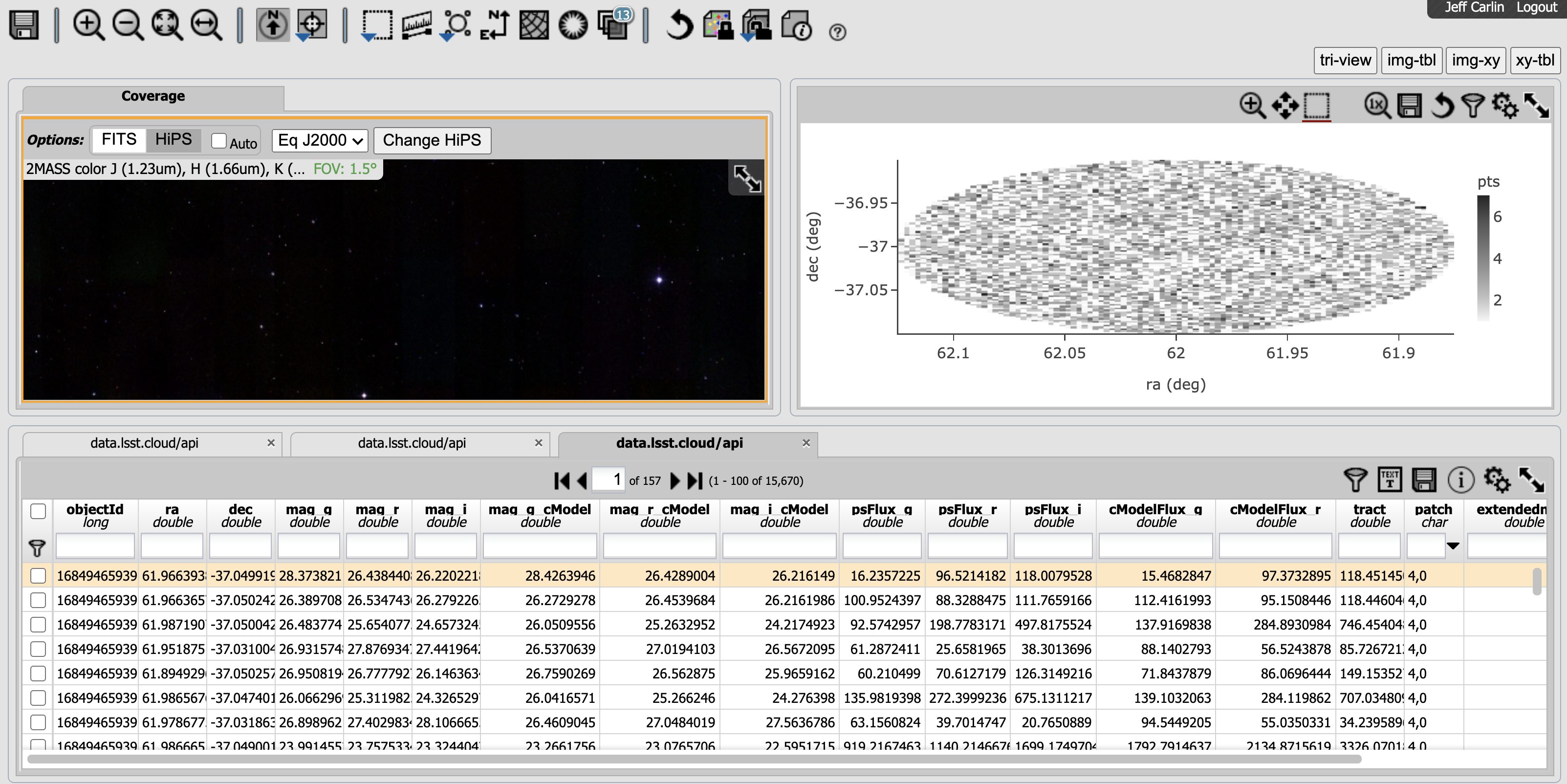
Results from a 0.1-degree query of the DP0.1 Object catalog.
In the tutorial notebook, you would execute the same query as above, and then queried the truth_match table for the same region of sky, like this:
SELECT ra, dec, mag_r, match_objectId,
       flux_g, flux_r, flux_i, truth_type, match_sep, is_variable
FROM dp01_dc2_catalogs.truth_match
WHERE CONTAINS(
POINT('ICRS', ra, dec),
CIRCLE('ICRS', 62.0, -37.0, 0.1)) = 1
AND match_objectId >= 0
AND is_good_match = 1
Notice that you included additional constraints in the last two lines.
Objects in the truth-match table that do not have matches in the object table have “match_objectId = -1,”
while those with legitimate matches contain the objectId of the corresponding object from the object table in “match_objectId.”
By requiring this to be greater than or equal to zero, you extract only objects with matches.
You also keep only sources satisfying the “is_good_match” flag, which is described in the schema as being “True if this object–truth matching pair satisfies all matching criteria.”
(Note that “1” and “TRUE” are equivalent in ADQL.)
When exploring the notebook, you can continue by creating Python dataframes of the two tables, then matching them based on the IDs.
But in ADQL, you can do the matching of tables directly by joining on the requirement that “match_objectId” in the truth-match table equals the objectId from the object table.
This is how the JOIN is done:
SELECT obj.objectId, obj.ra, obj.dec, obj.mag_g, obj.mag_r,
       obj.mag_i, obj.mag_g_cModel, obj.mag_r_cModel, obj.mag_i_cModel,
       obj.psFlux_g, obj.psFlux_r, obj.psFlux_i, obj.cModelFlux_g,
       obj.cModelFlux_r, obj.cModelFlux_i, obj.tract, obj.patch,
       obj.extendedness, obj.good, obj.clean,
       truth.mag_r as truth_mag_r, truth.match_objectId,
       truth.flux_g, truth.flux_r, truth.flux_i, truth.truth_type,
       truth.match_sep, truth.is_variable
FROM dp01_dc2_catalogs.object as obj
JOIN dp01_dc2_catalogs.truth_match as truth
ON truth.match_objectId = obj.objectId
WHERE CONTAINS(
POINT('ICRS', obj.ra, obj.dec),
CIRCLE('ICRS', 62.0, -37.0, 0.1))=1
AND truth.match_objectid >= 0
AND truth.is_good_match = 1
Try the above query in the ADQL window – you should retrieve 14,424 results.
Just to confirm that things look as expected, you should plot a color-magnitude (g vs. g-i) and color-color (r-i vs. g-r) diagram.
Since you won’t be using the image any more, switch to the view with only the table and an xy-plot by clicking the “xy-tbl” at the upper-right.
To plot a color-magnitude diagram, click on the double gear icon in the xy-plot panel (it should say “Chart options and tools” when you mouse over it).
Enter the values seen in the example below. You will use the “cModel” magnitudes, plotting g vs. g-i, to make a color-magnitude diagram.
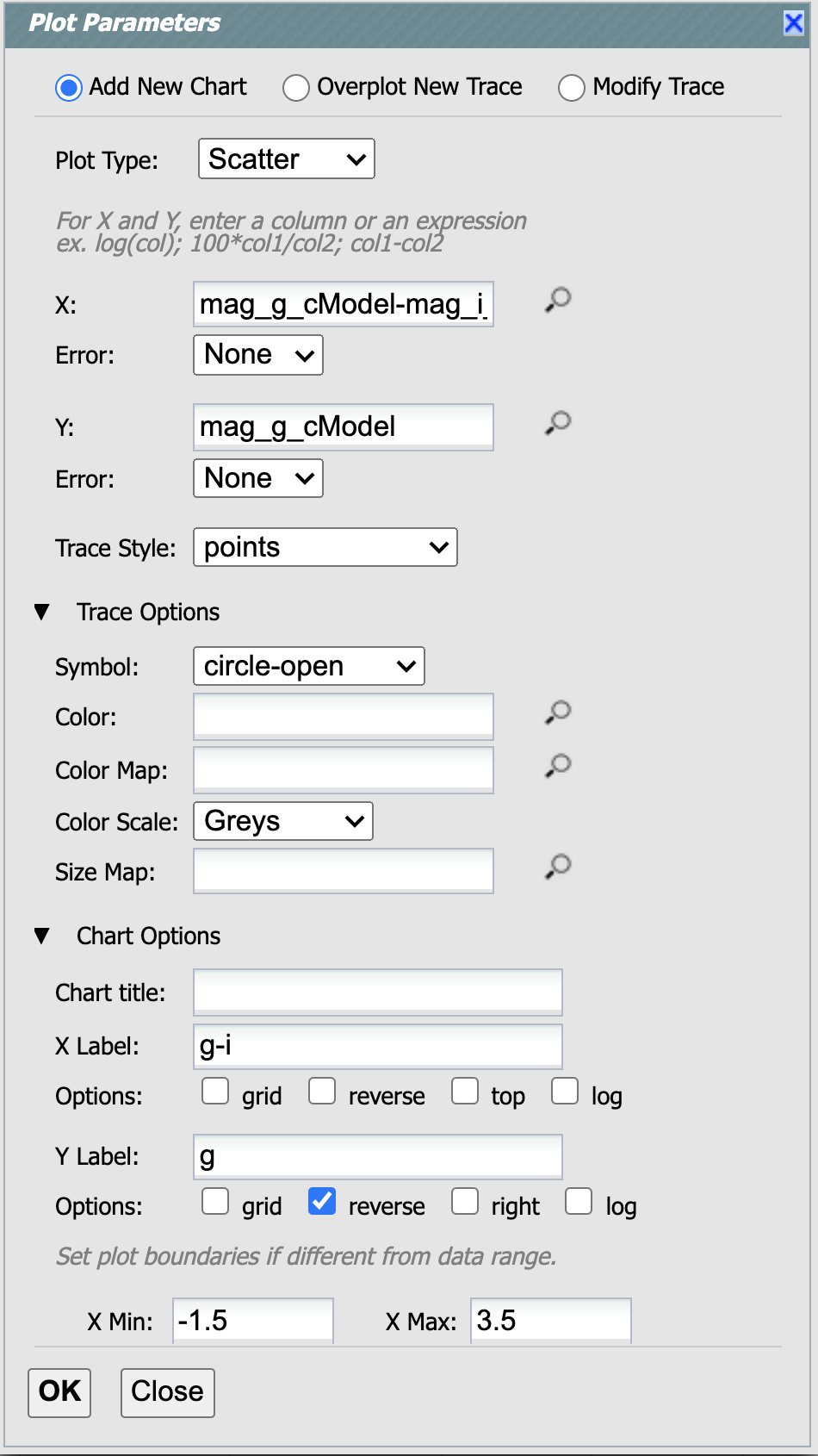
Example of creating a plot in the Portal.
Now create another plot by again clicking the double gear icon, and entering the following:
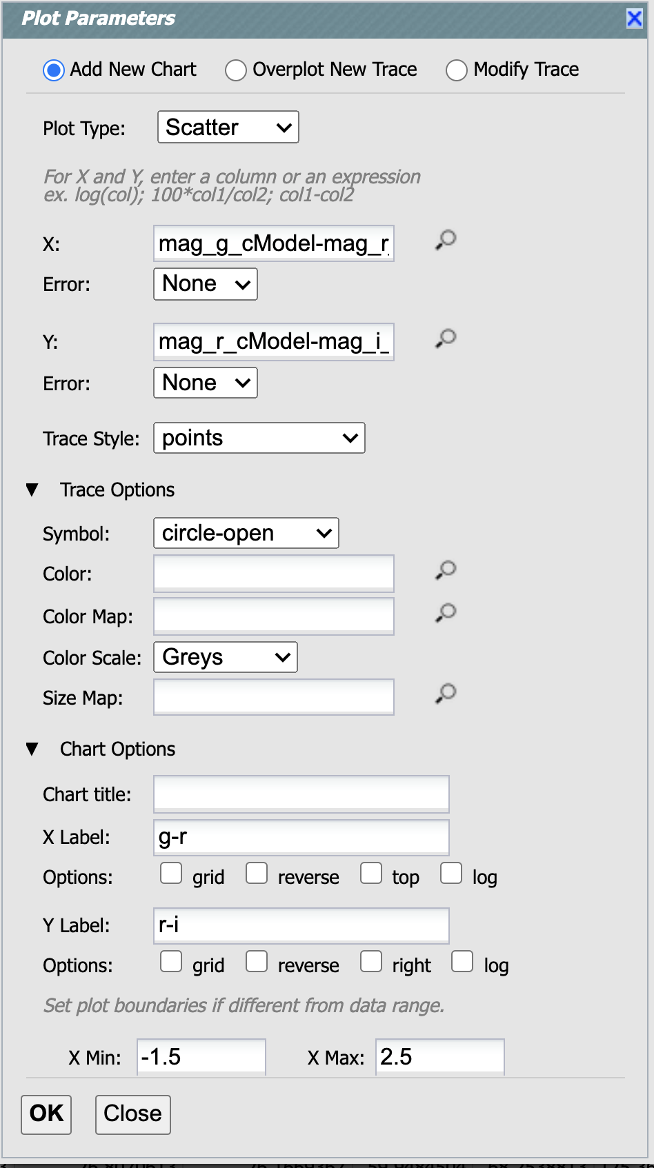
Another example of creating a plot in the Portal.
Initially, the figures look kind of smashed into the top-half of the screen. Click the double arrow icon at the upper-right to make the figures take up the whole screen. Then, you should have something that looks like this:
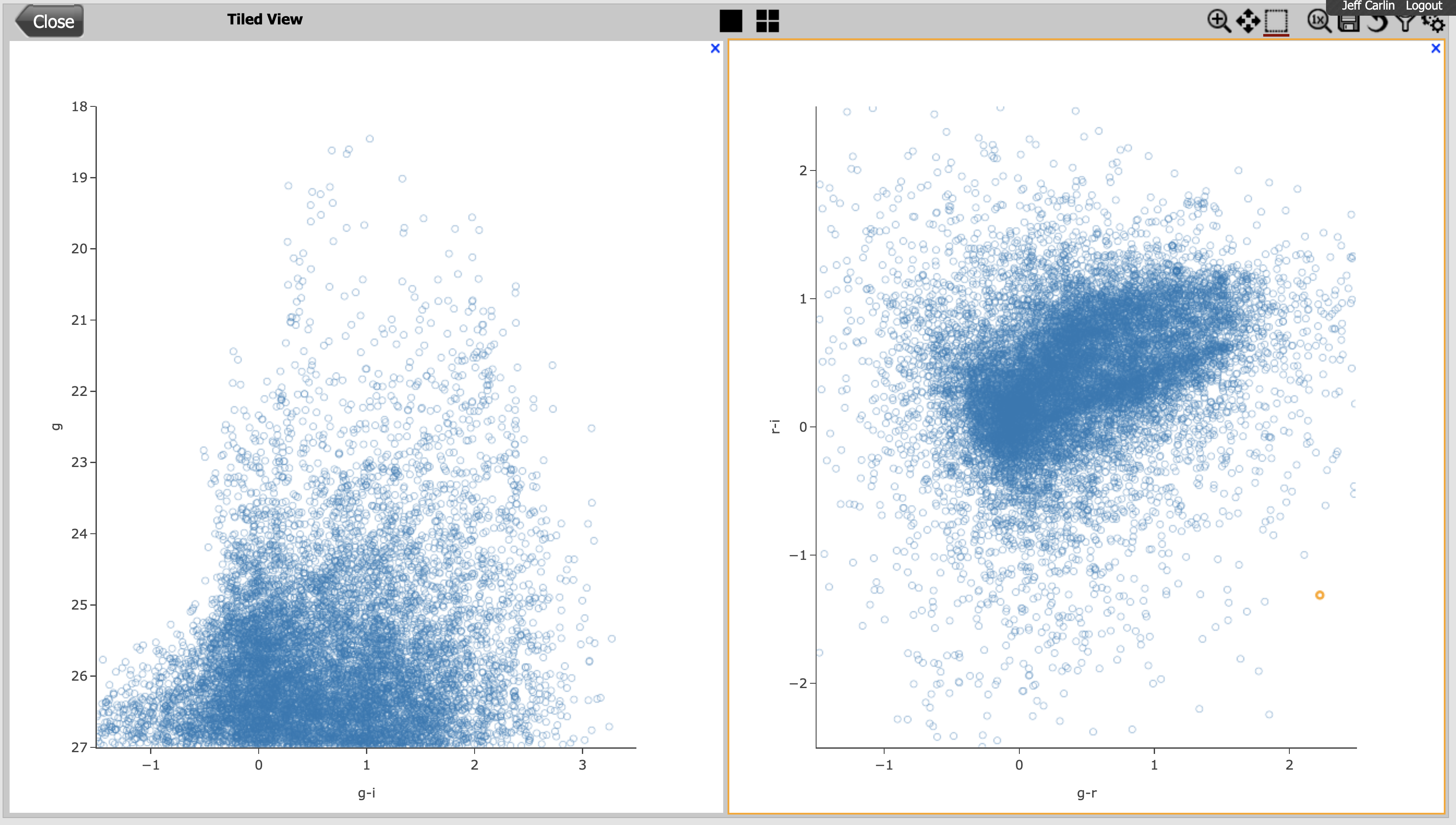
Those figures are a bit messy, because they contain more than 14,000 points.
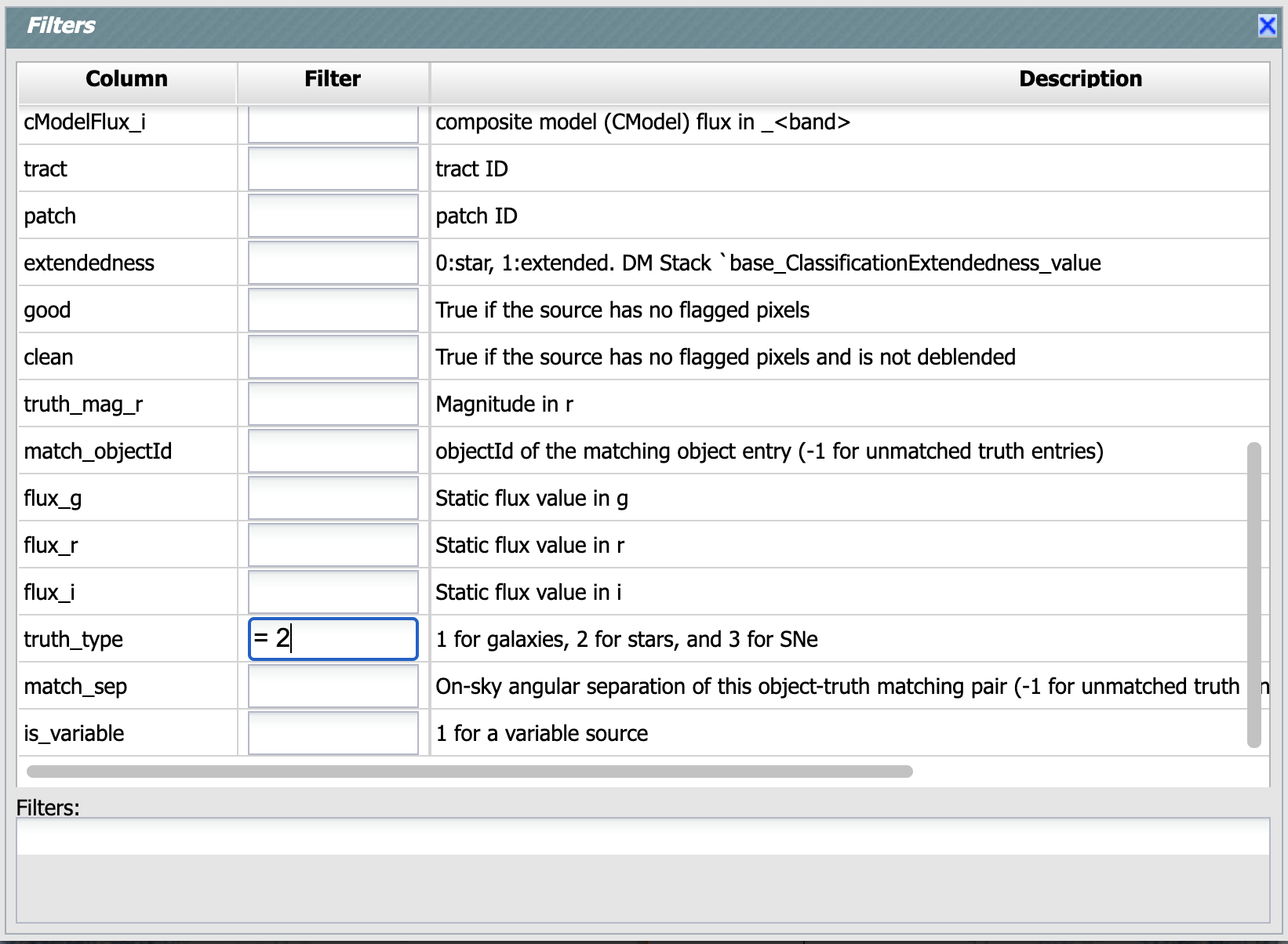
Next, you will filter the points to plot only stars.
To do this, first separate the “stars” and “galaxies” using the truth_type column from the truth-match table.
Simulated stars have truth_type = 2, and galaxies have truth_type = 1.
If you click on the filter icon at the top of your figures, you can enter text like the following in the box that pops up.
This will keep only points with truth_type = 1.
Feel free to play around with filtering based on other columns!
After filtering both panels, you should get color-magnitude and color-color diagrams that look like this:
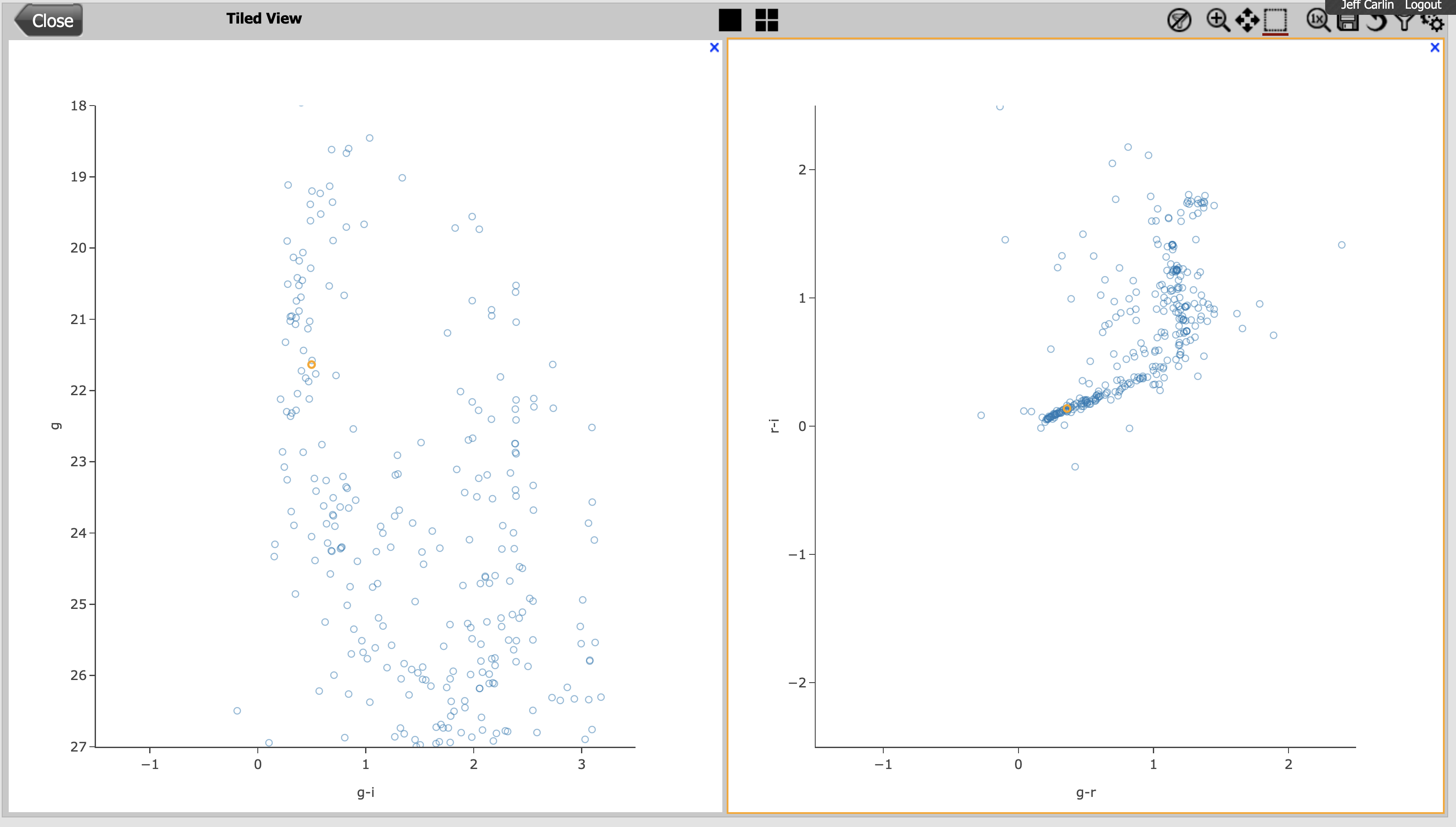
Hooray - the stars lie on a narrow locus in the color-color plot, as you might expect!
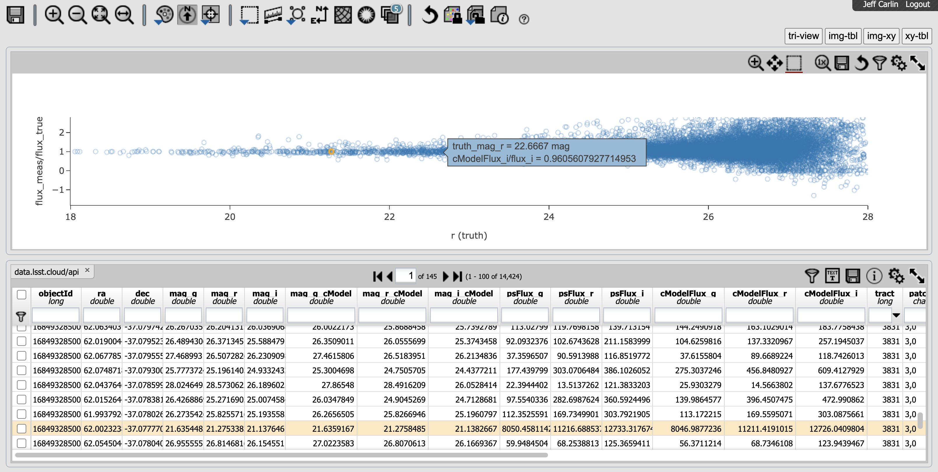
Finally, try comparing the measurements from the object table to the “true” values for some objects. You will compare the recovered flux to the “true” value that was simulated for each object (as a ratio of the fluxes). Once again click on the double gear icon, and create a new scatter plot with the following parameters:
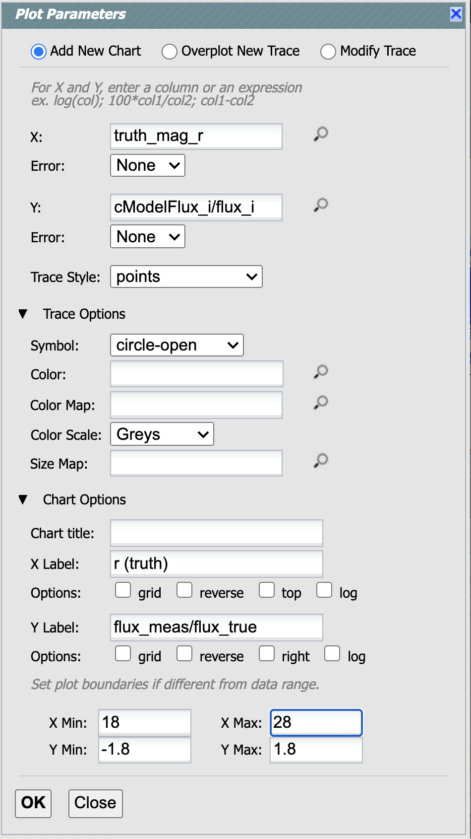
The resulting figure should look something like the one below. Most of the points lie along a line at y-axis values near 1.0, meaning that the measured fluxes are roughly equal to the simulated (input) fluxes.
That’s reassuring!
One final note: in the screenshot below, you can see that hovering over a point in the figure will tell you the values of that point. Furthermore, if you click the point, you can see that it is then highlighted in the table.